All-in-One Trip Planning
For this personal project, I redesigned Airbnb's post-booking experience to close the planning gap that drives users away after they book. Grounded in research with 20 users, this self-initiated AI concept introduces a four-step onboarding flow that asks about arrival time, group size, trip vibe, and pace, then instantly generates a fully customizable itinerary that keeps users inside Airbnb from booking all the way to arrival.
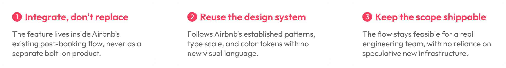
Because this was a personal project with no client and no real constraints, I set my own. The goal wasn't just to design a feature. It was to practice designing within the kind of business and technical limitations a real Airbnb team would face.

Personal Project
Feature Design / Interaction Design / UX Research
09.2024 - 10.2024
Context
Airbnb: The Global Standard for Modern Stays
Airbnb is the world's leading travel platform with a 44% market share of all home rentals. As of 2024, it lists over 8.1 million homes across 220+ countries and records 491 million bookings a year. Even at that scale, the platform still requires users to manually search and plan their trips, leaving a clear gap between booking a stay and actually experiencing the destination.
Problem
Users Feel Overwhelmed, Undersupported, and Unheard
Travelers want a one-stop solution but get a disconnected experience. Airbnb isn't yet a complete travel platform. Users ignore "Experiences" because they feel irrelevant, and the stress of switching between multiple apps makes planning exhausting. This fragmented journey hurts both satisfaction and retention.
of travelers abandon online booking due to poor experiences according to SiteMinder's 2025 report.
Constraint
With No Client to Limit Me, the Hardest Skill to Practice Was Restraint.
After research, my first instinct was a full redesign of the post-booking experience. But a full redesign is exactly the kind of solution that never ships at a company like Airbnb. Engineering capacity is finite, brand consistency is non-negotiable, and any new feature has to earn its place inside an existing flow used by hundreds of millions of people. So I set three constraints to design against, as if I were on the actual team.
"How might we help users plan their entire trip inside Airbnb, so the moment after booking feels supported instead of overwhelming?"
Solution
01. Tailored Travel Questions Powered by AI
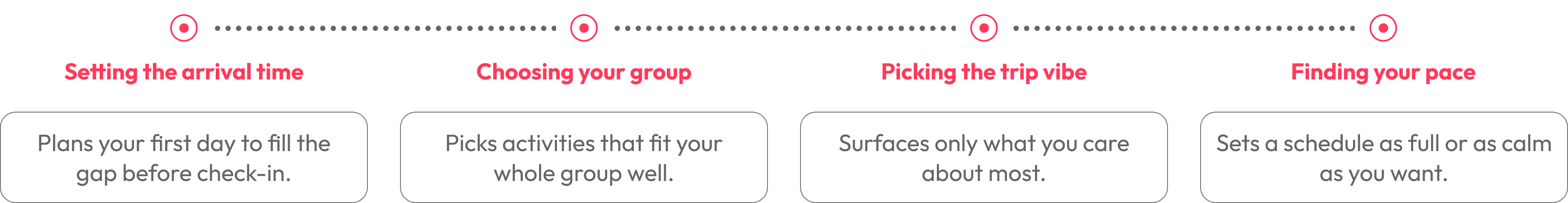
The feature opens with a four-step onboarding flow that turns trip planning into a short conversation. It learns the traveler's timing, group, taste, and pace, then generates a plan tailored to them, so the result feels personal from the first screen without the effort of building it themselves.
02. AI-Generated, Customizable Trip Plan.
From those four answers, the system instantly creates a complete personalized plan, from stays to experiences. Every element is fully editable, preserving the user's autonomy to adjust pace, swap activities, or fine-tune details.
How I got there
User Research with Real Users
To identify gaps in Airbnb's post-booking experience, I surveyed 20 users who had booked travel in the past year. The pattern was clear: planning felt hardest and most unsupported right after booking accommodations. I followed up with interviews with four participants to understand their travel values, including flexibility, trust, timing, and autonomy. The core insight: users wanted smarter, better-timed support that adapts to their intent without creating extra work.
"Post-booking planning as difficult or time-consuming."
"Experience feature is confusing and still time-consuming"
"Too many options without proper guidance makes me give it up."
Landing on four core questions
My research surfaced four distinct user needs: timing, group fit, relevance, and energy. My first onboarding draft tried to capture all of them with depth, which meant eight to ten questions. Testing showed drop-off after question five. Users wanted personalization, but not at the cost of an interrogation.
I cut to the four questions that each unlocked the most planning value per answer: When do you arrive? Who's coming? What's your vibe? What's your pace? Four questions, four high-leverage signals, no filler. Anything beyond that was the AI's job to infer, not the user's job to answer.
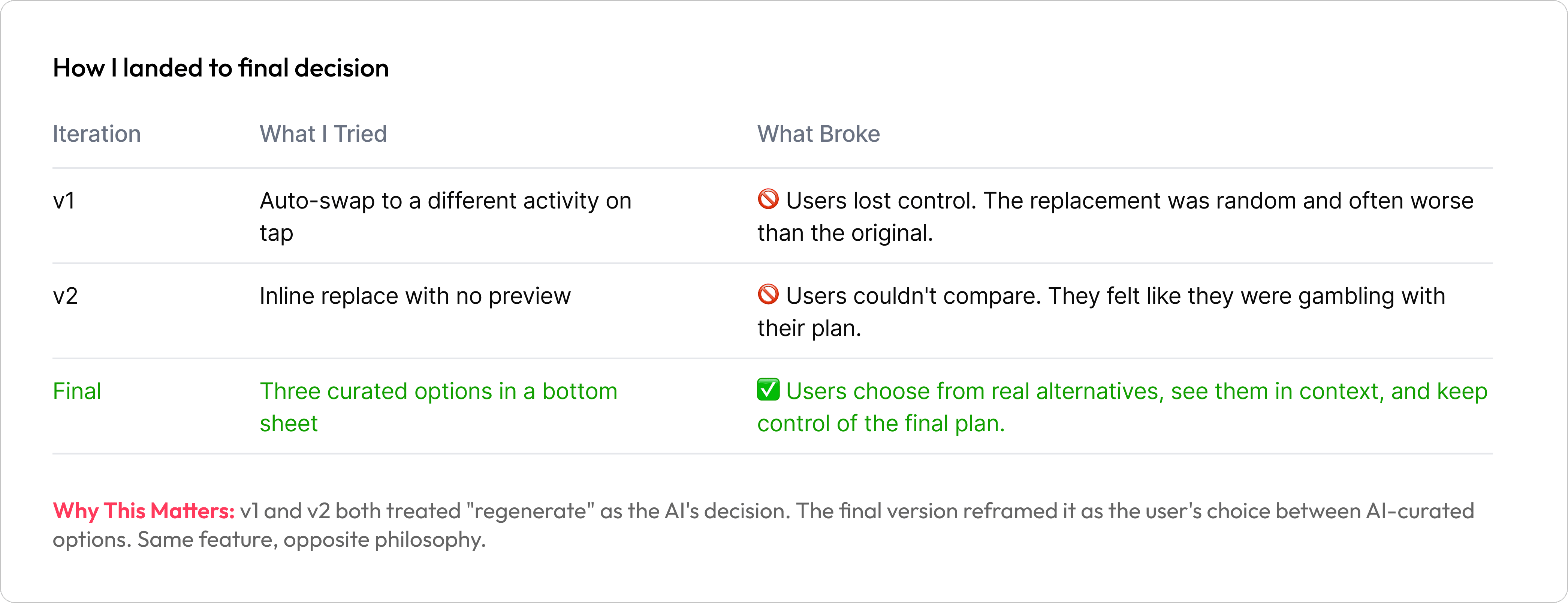
Iterating the "regenerate" interaction
Letting users swap an activity they didn't like sounds simple. It wasn't.
Outcomes & Impact
Validating User Control & Intent
Through prototype testing with users from the research pool, I measured how the redesigned flow performed against the current fragmented experience.
Satisfaction: 92% of testers rated the planning experience positively, compared to the frustration documented in the current-state research.
Repeat intent: 70% said they would use Airbnb for trip planning again if this feature existed, directly addressing the retention gap identified in the problem.
These numbers validate the core thesis: users don't want more options. They want the right options, delivered at the right moment, with the autonomy to adjust.
Reflection
The Discipline of Not Redesigning Everything
The hardest decision in this project wasn't a flow or a screen. It was choosing not to redesign Airbnb's existing booking experience, even though the research surfaced friction there too. Self-initiated projects make full redesigns tempting because nothing stops you. The discipline is to design for what could actually ship: integrating into an existing flow, respecting an existing design system, staying within plausible engineering scope.
The second thing this project changed for me is how I think about AI in consumer products. The four-step intake is intentionally short because every extra question the AI asks costs trust. The user has to feel that the AI is reducing their work, not extracting more inputs to do its job. That ratio — what the user gives versus what the AI returns — is the design problem, and it doesn't get solved by making the model smarter. It gets solved by asking less.
If I were to take this further, I'd want to validate the AI-generated itineraries against real Airbnb listing data and against actual traveler behavior post-booking, not just survey-stated preferences. The n=20 sample told me the problem is real. It can't tell me whether the solution survives contact with a real itinerary.
