Nonprofit UX Rebuild
During a 10-week internship, I led the website redesign for ForYouPage (FYP) to resolve core navigational friction and clarify its organizational mission. By implementing a high-energy design system and optimizing the Information Architecture, I transformed a fragmented user journey into a conversion-focused experience. Although the project remains a "North Star" for future development, it established the primary design tokens and scalable components that now govern FYP’s visual identity.

My Contributions
I led the end-to-end redesign of the ForYouPage homepage, clarified the information architecture to improve mission clarity, conducted user research and content audits to identify key usability issues, and defined success metrics to measure engagement improvements within a team of 1 designer, 1 developer, and 1 project manager.
Product Designer
07.2024 - 09.2024
Interaction Design / UX Research
Internship / Cross-Functional Teamwork
Context
Championing UX in a Grassroots Environment
ForYouPage (FYP) is a youth-led nonprofit that helps young people launch social impact projects across mental health, sustainability, and civic engagement. When I joined as their first-ever design intern, the organization had no existing UX guidelines, no analytics tooling, and no formal design workflow.
My mandate was dual: deliver a redesigned website that would improve conversions and mission clarity, and establish the design foundations that the team could carry forward independently. I worked directly with the PM/Lead who owned product direction, and two frontend developers responsible for eventual implementation.
Because the project was scoped as a "North Star" redesign — validating direction before full build — I owned the full design cycle from research to high-fidelity prototype, with usability testing as the primary success metric.
Problem
Visitors Left Without Understanding What FYP Actually Does
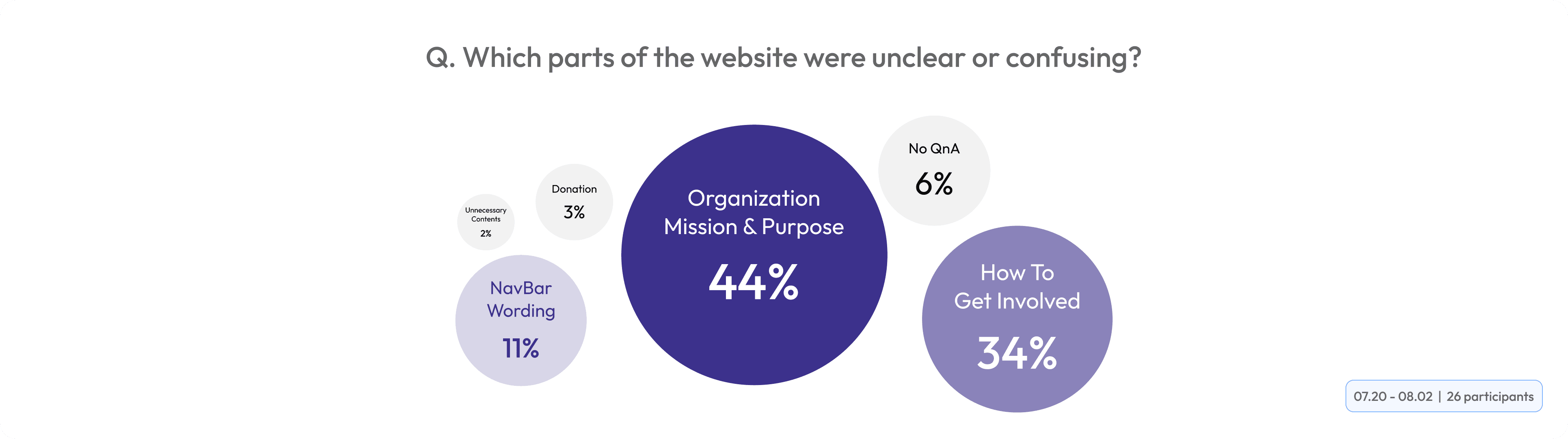
I started by experiencing the existing site as a first-time visitor — the most honest user test available. Even after multiple sessions, two questions went unanswered: "What does this organization do?" and "How do I get involved?" These weren't edge cases. They were the critical questions every new visitor would arrive with.


"How might we help first-time visitors immediately understand what ForYouPage is and take a confident first step toward getting involved?"
Solution
01. From Confusion to Clarity
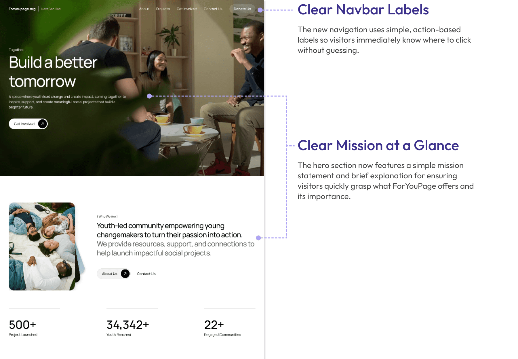
Replaced audience-segmented navbar labels and three competing CTAs with intuitive navigation and a single, focused entry point for new visitors.
Before
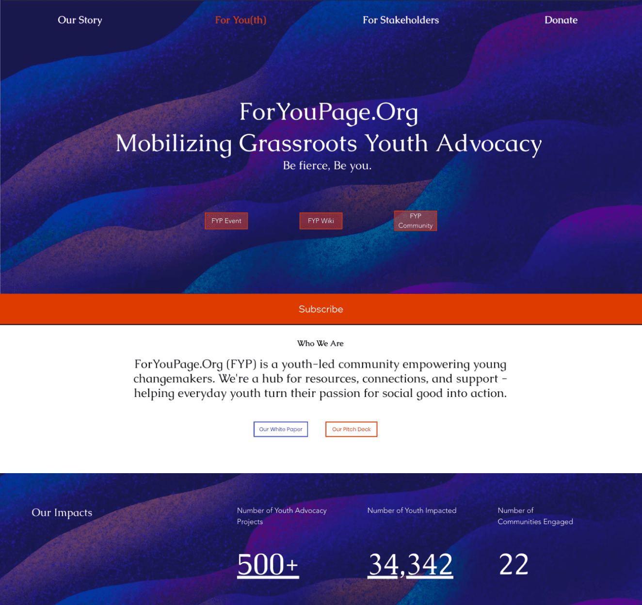
🚫 Unclear Navbar Labels: Labels like "For Stakeholders" assume prior knowledge of the org.
🚫 Competing CTAs: Three identical red buttons side-by-side with no descriptions or visual priority.
After
✅ Clear Navbar Labels: The new navigation uses simple, action-based labels so visitors immediately know where to click without guessing.
✅ Primary CTA Button: Unfamiliar users can't choose between three CTA buttons without background knowledges , so a single "Get Involved" removes the friction entirely.
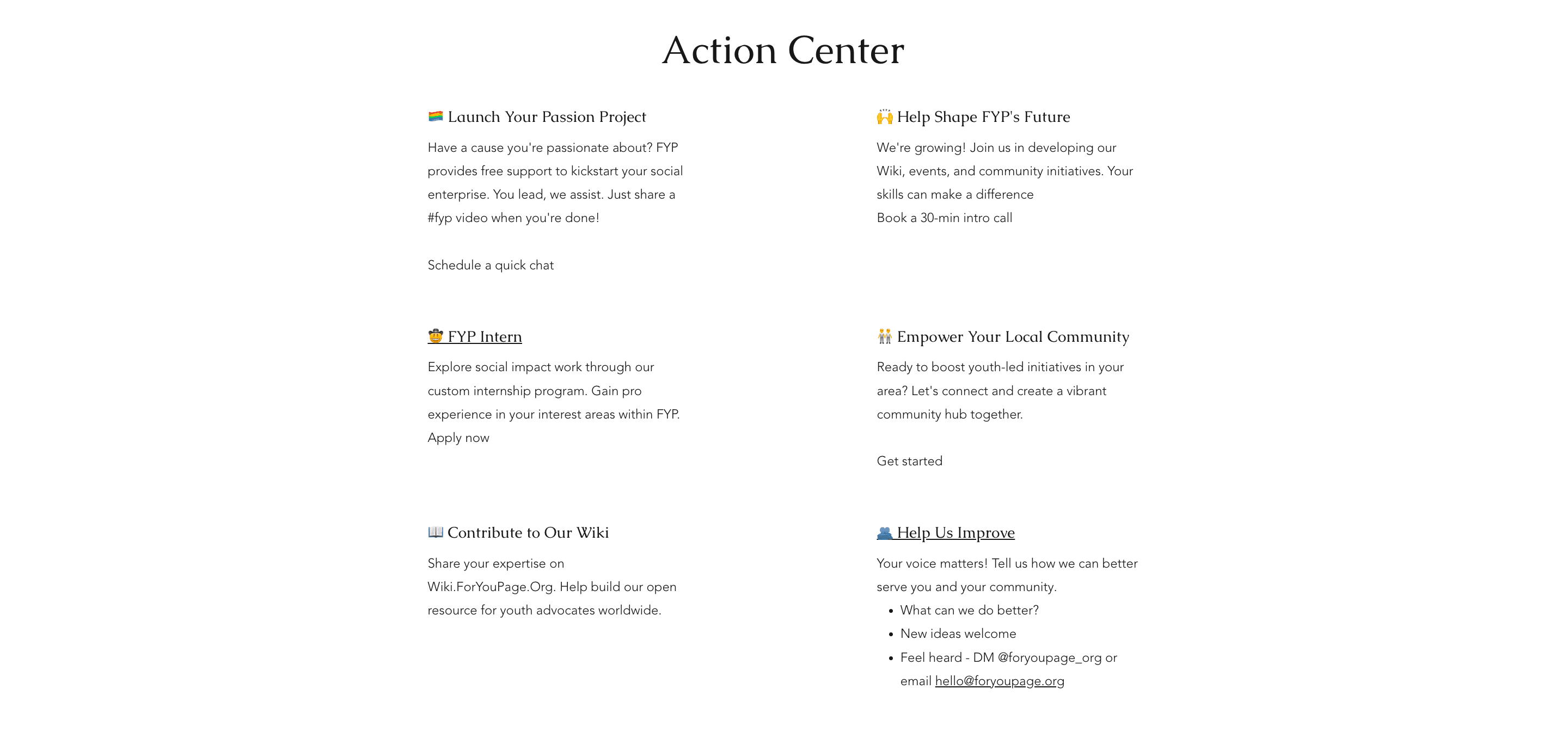
02. From Dead End to Clear Next Step
Added a structured "Get Involved" section with distinct paths so newcomers always know exactly what to do next.
Before
🚫 No Onboarding Path: The prior site gave no guidance on how to actually get involved.
After
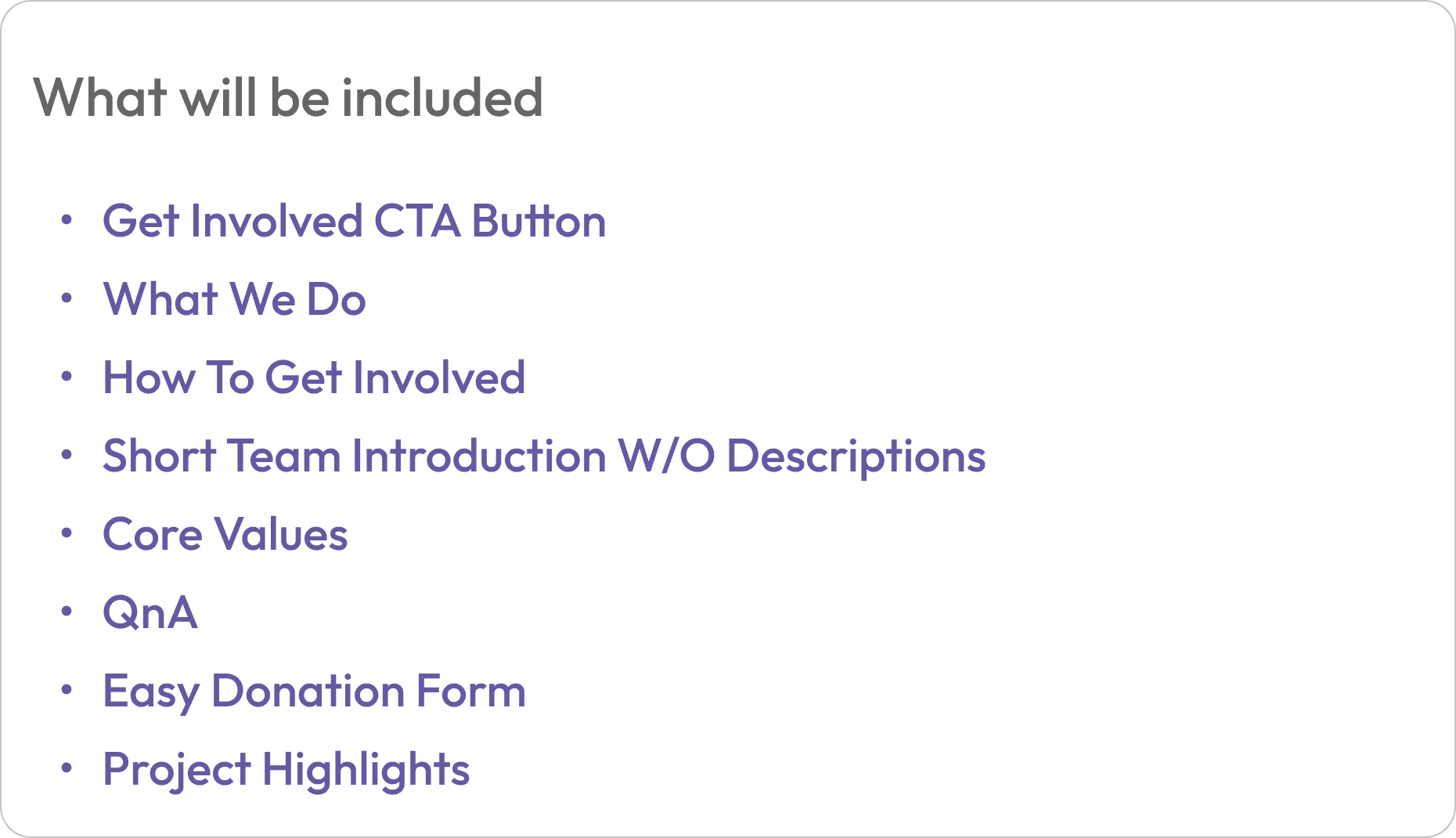
✅ Guided Path to Get Involved: The Get Involved section now organizes actions with a clear starting point for newcomers. Options such as Learn, Contribute, and Lead are presented as separate paths for reducing confusion and guiding visitors on their next steps.
03. From Overload to On-Demand
Replaced 6 equal-weight content blocks with a scannable FAQ accordion that lets newcomers find answers without reading everything at once.
Before
🚫 Decision Overload: 6 equal-weight options with no recommended starting point leave new visitors paralyzed on where to begin.
After
✅ Scannable FAQ Accordion: Visitors expand only what's relevant, instead of reading all 6 blocks upfront.
04. From Wiki to Website
Surfaced FYP's values and team directly on the site so newcomers never get lost in an internal document.
Before
🚫 Wiki Overload: Newcomers land on a dense internal document with no context, making it impossible to understand FYP's purpose before being buried in principles and governance pages.
After
✅ Values & Team at a Glance: Key information surfaced directly on the site so newcomers never have to leave for an internal wiki to understand who FYP is.
05. Unified Contact & Donation Forms
Replaced missing contact flows with consistent, structured forms that let newcomers reach out or donate without leaving the site.
Before
🚫 No Contact & Donate Form: Visitors had no way to directly reach FYP from the site, killing any momentum to get involved.
After
✅ Consistent Form Design: Both "Contact Us" and "Donate" use the same structured form pattern, reducing friction and keeping users on-site.
User Research
Validating Assumptions with Mixed-Method Research
To avoid designing for myself, I ran a two-cohort study before touching any pixels: new users who had never heard of FYP (n=13) and current community members (n=13). The goal was to baseline perception gaps between how the organization saw itself and how outsiders experienced it.
Content Audits
Ruthlessly Prioritizing Value
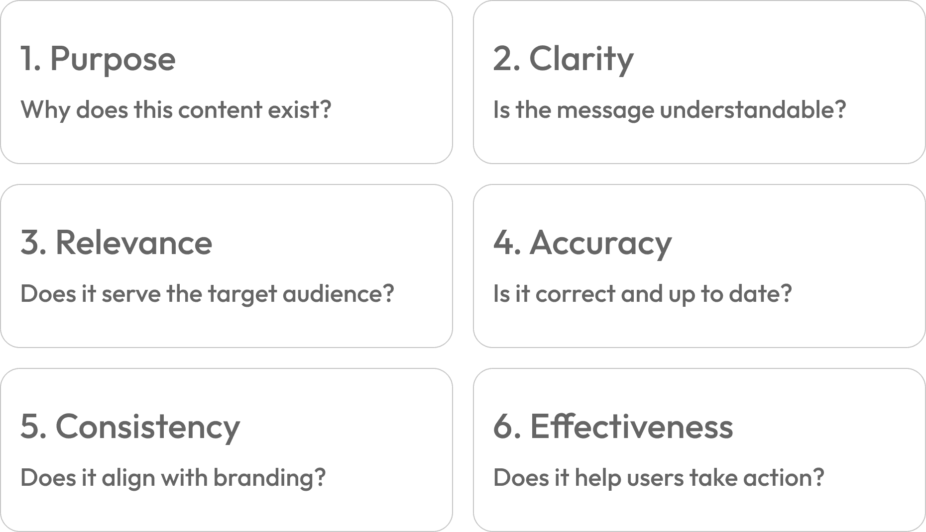
I performed a comprehensive content audit, evaluating each page across six key criteria to measure engagement effectiveness. This identified content that failed to serve the audience or guide users toward a clear action, allowing me to prioritize and restructure the site for maximum impact.
Design Constraints
Building a Design System from Zero
FYP had no existing design tokens, component library, or documented visual language. Rather than designing one-off screens, I established a foundational system first — ensuring every downstream decision would be consistent, scalable, and handoff-ready for the dev team.

Usability Testing & Impact
Proving Impact Through Prototype Validation
All outcomes were measured by comparing participant behavior on the redesigned high-fidelity prototype against the legacy experience in controlled usability sessions (n=13 evaluative test group). Because the site had not yet launched publicly, these are prototype-derived metrics — directionally strong, not yet production-confirmed.

Reflection
What This Project Taught Me About Designing Without a Net
This project reinforced the importance of clarity and trust in mission-driven design. Navigating constraints—such as the absence of an existing design system and limited analytics access—shaped a process rooted in intentionality. It proved that user-centered decisions and scalable foundations can be established even in the most resource-constrained environments.
